HiQ Brand
Put the thing down, flip it and reverse IT.
In it’s essence the new HiQ brand is playful, geeky and self-aware. The brand is not timid and doesn’t blindly follow the common IT consultancy trends.
It doesn’t try to conform to the industry mould yet does not purposely rebel against it.
Keep IT playful - the visual language of the brand
Stockholm based HiQ was founded in 1995. From early on the HiQ brand had a distinct look and feel to it - more colourful, analogue and free-spirited than it’s contemporaries. By 2020s though the identity had grown stale and dated even though it still stood out - just not in a positive way anymore.
We wanted it to remain loyal to the freewheeling spirit of HiQ as a brand and a workplace and create an identity that was still truly unique - and not just within it’s category.
The new identity is best described as little mischievous. Instead of anchoring it into a rigid palette of 2 to 3 colors and the generic almost stock photo like imagery of IT consultancies it consists of almost surrealistic bespoke illustrations and expressive typography.
The identity’s visual building blocks are the trinity of Angular (low polygon elements in illustrations, buttons, underlying grids), Rounded (backdrops, image mask - mobile aesthetic) and Organic (analogue elements in illustrations, handwriting, logo).
These elements provide a vast amount of needed variety in the usage of the brand. It can easily be toned down for a respectable contract template or be turned to 11 for a recruitment event.


The logo was completely redrawn, but still retains the hand-lettered aesthetic of the 1995 ink doodle.
Final logo has an dynamic italic slant for a more signature feel with a subtle lightning bolt running through it.


Unrefined & organic yet technical typography

Reimagine IT
Illustrations play a key role in the new HiQ brand. They are always bespoke and 3D-based (unless a 2D illustration style is tailored to compliment them).
Quirky, weird, colorful and humorous combining organic and “techy” elements. Conceptually abstract and stylistically unique.
The illustration concepts explore almost surrealistic metaphors for fairly visually uninspiring topics.


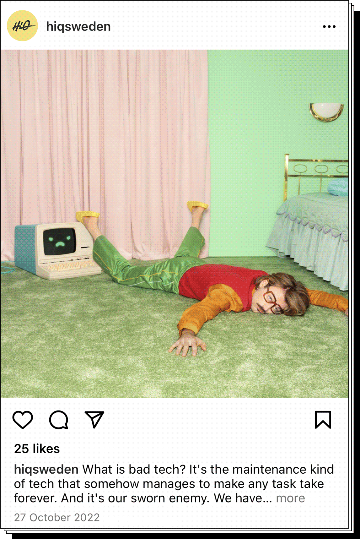
“Say no to bad tech” online campaign photography


Obviously (mostly) digital
Naturally an identity for an IT consultancy is almost solely designed for digital use. Company swag and exhibition stands being the analogue exception.
Almost all illustrations are animated and optimized to be used on screens - such as the group website, social media posts and targeted online advertising.

