Quantum Break Interface
Interface for an AAA Xbox title.
Quantum Break is a sci-fi adventure AAA game set in the near future and not-so-distant past. When designing the look of the UI we first asked ourselves why is the design of sci-fi movies and games almost always so outdated and retro compared to the direction design in the real world is heading.
Modernism.
We believe that most functional interfaces will continue to become more minimal in the next 10 years and wanted the UI to reflect this and include a level of realism to it. The interface design aims for modernism, not futurism.

We wanted a clear visual disctinction between the overall look and feel of the gameplay and the menus, but still a solid connection to the actual game and the game's Monarch Corporation's slightly fascist undertones. To achieve this we used monochramatic 3D renders and an extremely minimal palette. No gradients, glows, unnecessary button frames or any visual fluff.
For a visual connection to modern interfaces we used a light theme throughout the menus. This was also to emphasize negative space and typography. Pure white and extremely small type was avoided due to variety of screen types we were designing for.


Various HUD interactions

Optimized for all screen types.
Amongst the many details we focused on, we noticed that basically all games we benchmarked had an issue with blurry HUD elements due to subpixel placement or downscaling of assets. We wanted to avoid this and bring in more visual detail and clarity.
This was achieved by handcrafting each element for all screen densities using a pixel grid.

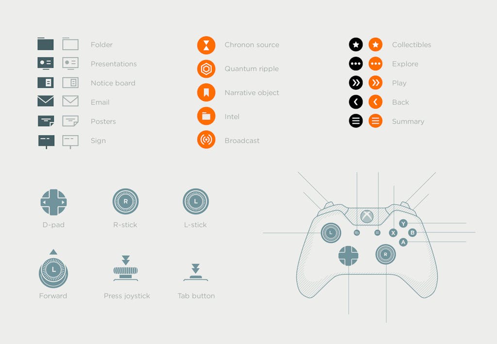
Guideline to refine the user experience
To design and optimize the navigation model and finetune the UX we produced a fully working prototype with HTML5 controllable with a Xbox One standard controller.
The prototype was also used to design the UI/UX for the PC version of the game.